Design system
Design system
The Deltatre Apps design system provides a comprehensive collection of reusable UI components and design tokens that streamline the process of theming and skinning apps:
- Reusable UI components: Logos, icons, buttons, and rows.
- Design tokens: Colors, gradients, typography
Reusable UI components
Logos and Icons
Logos and icons are themed by providing SVG graphics files.
Import your SGV files into the app/src/main/res/drawable directory to override the default ones and add new ones.
Buttons
Buttons are setup in the app/src/main/res/values/masterbuttons-ds.xml file. It contains styles and sizes corresponding to the button component pages on MISSING_LINK.
In addition, to alter the visual display of the primary buttons and backgrounds, you can supply your own XML files.
XML file names:
primary_button_default.xml primary_button_focused.xml primary_button_default_tv.xml primary_button_focused_tv.xml
Example:
<?xml version="1.0" encoding="utf-8"?>
<shape xmlns:android="http://schemas.android.com/apk/res/android">
    <solid android:color="@color/GlobalButtonPrimaryBackgroundDefault" />
    <corners android:radius="@dimen/primary_button_corner_radius_tv" />
</shape>
Rows and Margins
The masterrows-ds.xml and masterrows-tv-ds.xml handle updating grid margins and row grid counts. For explanation of the row grid system please speak to design, but for those requiring increasing or decreasing tile width, this is where it is done.
Design tokens
Fonts
Add fonts by creating a raw assets directory and drop your font files in:
- font_regular
- font_bold
Colours and Gradients
The colours file is built directly from the design team's Figma export. It is not very Android friendly and contains a lot of platform specific styling.
This could cause some updating, but in the short term the solution works fine.
Please use the referenced file in the template repository, mastercolors-ds.xml and mastergradients-ds.xml.
The values correspond directly to core AXIS designs, and you should also be able to see them on new designs provided when clicking on the Figma elements. For more support on this contact the Design team.
Typography and Text Sizes
Typography and textsizes are setup in mastertypography-ds.xml and mastertextsizes-ds.xml.
These styles and sizes correspond directly to the styles and sizings in the Foundations component page on AXIS https://www.figma.com/design/f091mFQ0xfGgUqnPsj11LK/AXIS-Foundation?node-id=2-2&t=CpWjjhhlcWqRTD7q-0
As above, the correct element to use (Heading4, HeroStaticTitle etc) should be available in any new designs provided, if not please coordinate with the design team.
PLEASE NOTE: Since the SDKs have a single app architecture for both TV and mobile, styling and sizings are required separately for TV and mobile - for TV values, the extension _tv is added to dimension values or Tv for styles. The DesignSystemManager class in the core SDK takes care of setting these, you just need to update the variables to the correct values.
Design tokens walkthrough
The following referenced screenshots walk you through changing the homepages and item detail pages on Android mobile and Android TV. For other screens or examples please refer to the code directly.
Mobile
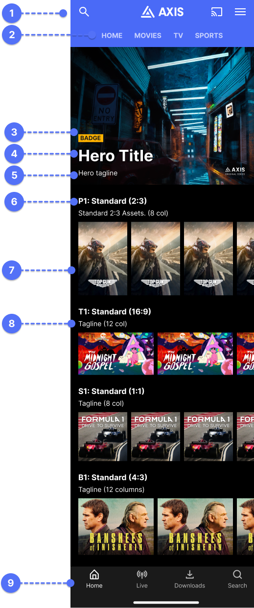
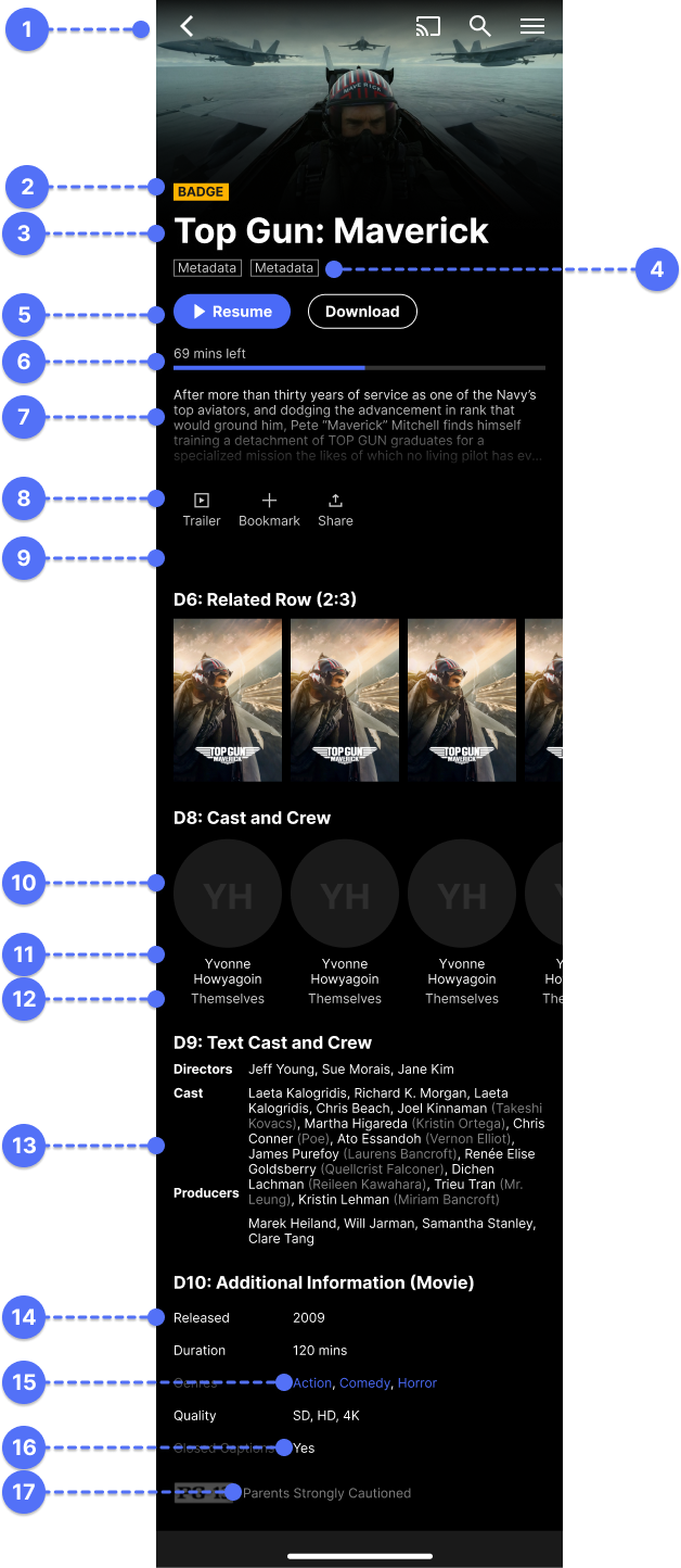
- 1. Background: mastergradients-ds.xml -> BackgroundBrand
- 2. Menu navigation: mastertypography-ds.xml -> NavigationTabs
- 3. Badge: mastercolors-ds.xml -> GlobalBadgeDefaultBackground, mastertypography-ds.xml -> Badge
- 4. Hero Title: mastertypography-ds.xml -> CarouselHeroTitleShort (Medium, Long)
- 5. Hero tagline: mastertypography-ds.xml -> HeroTagline
- 6. Default Row Title: mastercolors-ds.xml -> RowHeaderTextTitle, mastertypography-ds.xml -> Heading4
- 7. Poster Rowsize: masterrows-ds.xml -> column_count_poster_standard
- 8. Default Poster Tagline: mastercolors-ds.xml -> RowHeaderTextTagline, mastertypography-ds.xml -> Tagline
- 9. Bottom navigation icons: replace ic_bottom_nav_home, ic_bottom_nav_live, ic_bottom_nav_search,ic_bottom_nav_downloads, ic_bottom_nav_fallback
- 1. Back arrow: ic_arrow_left.xml
- 2. Badge: mastercolors-ds.xml -> GlobalBadgeDefaultBackground, mastertypography-ds.xml -> Badge
- 3. Hero Title: mastertypography-ds.xml -> DetailsOrListHeroTitle
- 4. Metadata: mastertypography-ds.xml -> Metadata
- 5. Button: masterbuttons-ds.xml -> PrimaryButton
- 6. Progress Bar: mastercolors-ds.xml -> GlobalProgressBar, mastercolors-ds.xml-> GlobalProgressBackground
- 7. Text: masterrows-ds.xml -> Body
- 8. Icons: ic_trailer.xml, ic_bookmark.xml, ic_share.xml
- 9. Default Row Title: mastercolors-ds.xml -> RowHeaderTextTitle, mastertypography-ds.xml -> Heading4
- 10. Round Meta Panels: TBC
- 11. Round Meta Panel Title: TBC
- 12. Round Meta Panel Subtitle: TBC
- 13. Cast and Crew: TBC
- 14. Additional Meta Title: TBC
- 15. Additional Meta Category: TBC
- 16. Additional Meta: TBC
- 17. Parental Advisory: TBC
TV
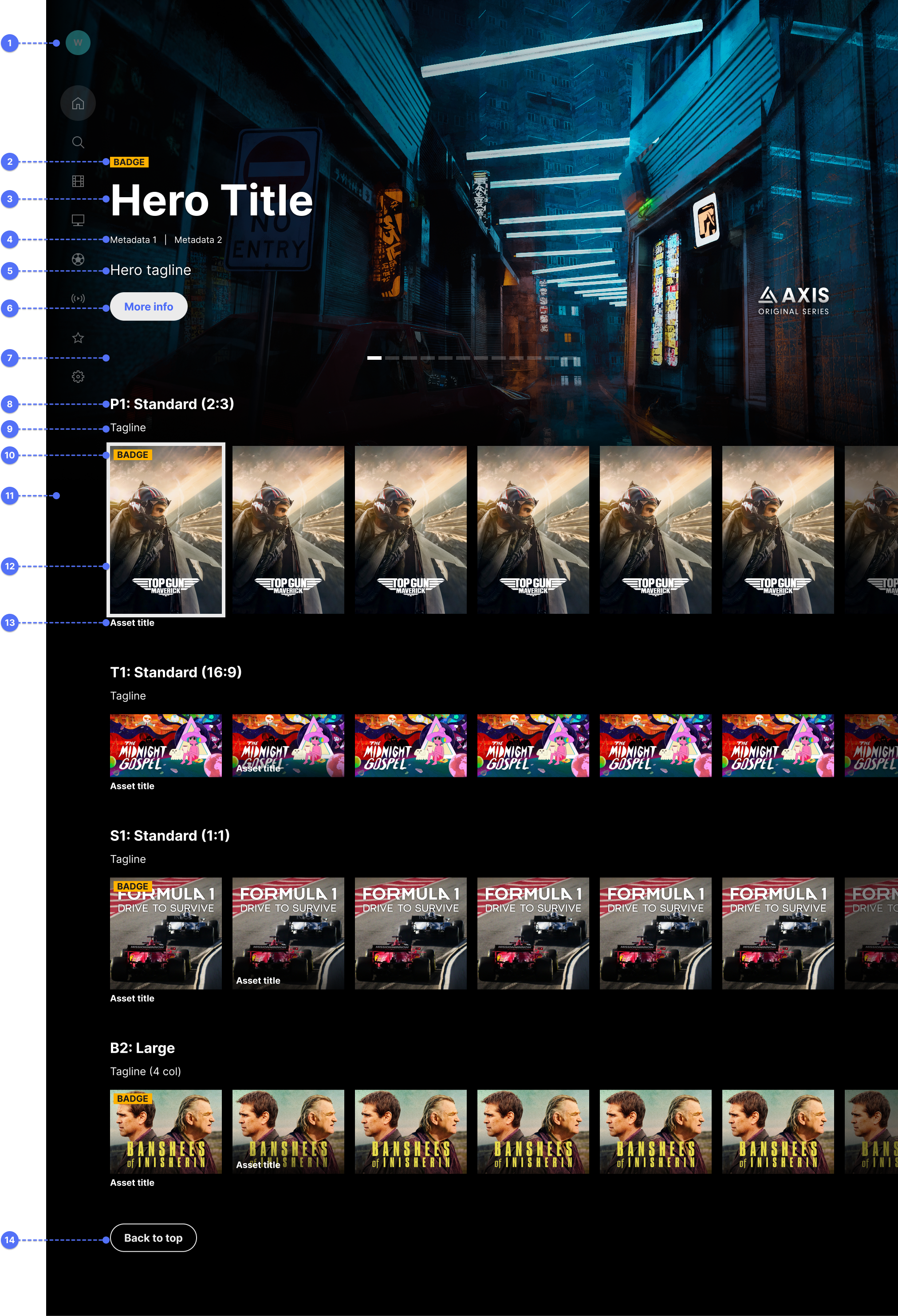
- 1. Side Nav Icons: ic_sn_fallback.xml, ic_sn_fallback_focused.xml, ic_sn_favourite.xml, ic_sn_favourite_focused.xml, ic_sn_movies.xml, ic_sn_movies_focused.xml, ic_sn_search.xml, ic_sn_search_focused.xml, ic_sn_sports.xml, ic_sn_sports_focused.xml,
- 2. Badge: mastercolors-ds.xml -> GlobalBadgeDefaultBackgroundTv, mastertypography-ds.xml -> BadgeTv
- 4. Metadata: mastertypography-ds.xml -> MetadataTv
- 3. Hero Title: mastertypography-ds.xml -> CarouselHeroTitleShortTv (Medium, Long)
- 4. Hero tagline: mastertypography-ds.xml -> HeroTaglineTv
- 6. Button: masterbuttons-ds.xml -> PrimaryButtonTv
- 6. Default Row Title: mastercolors-ds.xml -> RowHeaderTextTitle, mastertypography-ds.xml -> Heading4
- 7. HX Carousel Nav: TBC
- 8. Default Row Title: mastercolors-ds.xml -> RowHeaderTextTitle, mastertypography-ds.xml -> Heading4Tv
- 9. Default Poster Tagline: mastercolors-ds.xml -> RowHeaderTextTagline, mastertypography-ds.xml -> TaglineTv
- 10. Badge: mastercolors-ds.xml -> GlobalBadgeDefaultBackgroundTv, mastertypography-ds.xml -> BadgeTv
- 11. Gutter: masterrowstv-ds.xml -> main_gutter_tv
- 12. Focus Border: TBC
- 13. Small Asset Title: TBC
- 14. Button: masterbuttons-ds.xml -> PrimaryButtonTv
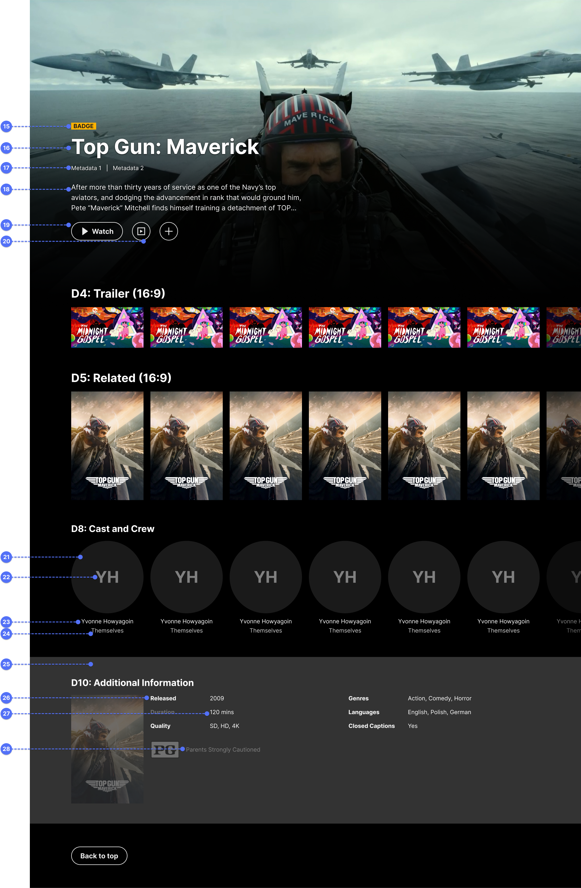
- 15. Badge: mastercolors-ds.xml -> GlobalBadgeDefaultBackgroundTv, mastertypography-ds.xml -> BadgeTv
- 16. Hero Title: mastertypography-ds.xml -> DetailsOrListHeroTitleTv (Medium, Long)
- 17. Metadata: mastertypography-ds.xml -> MetadataTv
- 18. Text: mastertypography-ds.xml -> Body
- 19. Button: masterbuttons-ds.xml -> PrimaryButtonTv
- 20. Icon Button: TBC
- 21. Round Meta Panels: TBC
- 22. Round Meta Panel Title: TBC
- 23. Round Meta Panel Subtitle: TBC
- 24. Cast and Crew: TBC
- 25. Additional Meta Title: TBC
- 26. Additional Meta Category: TBC
- 27. Additional Meta: TBC
- 28. Parental Advisory: TBC