Theming
Theming capabilities
The video player component allows customizing:
- Base colors
- Timeline and commentary icons
- Timeline icons size when keyboard-navigated
Where do I customize elements?
The settings file is where you can set elements customization. Find detailed instructions in the following Style guide paragraph.
Style guide
Base colors
Define colors for various player elements to align with your brand identity.
| Component name | Description | Default | Example |
|---|---|---|---|
| base2 | Base color | #CF030B | #0f4698 |
| base3 | Base color for tabs and buttons | #CF030B | #0f4698 |
| controlbarProgressBarBg | Color of the progress bar. | #CF030B | #0f4698 |
| chromecastProgressBarBg | Color of the progress bar in Chromecast | #CF030B | #b410b6 |
Generic base colors
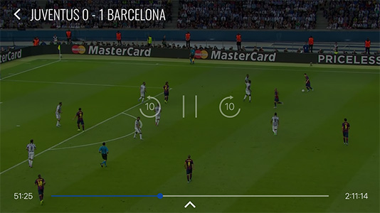
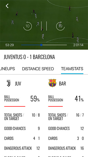
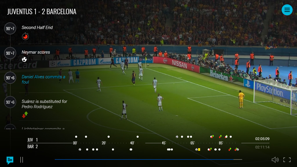
In the settings colours section, properties base2 and base3 allow customizing color for
- Buttons
- Progress bars
- Highlights
  "settings": {
          "colours": {
              "base2": "#0f4698",
              "base3": "#0f4698",
          }
  }
Base color Demo > #0f4698
Progress bar background
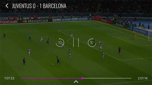
In the settings colours section, properties controlbarProgressBarBg and chromecastProgressBarBg allow customizing color for control bars.
  "settings": {
          "colours": {
              "controlbarProgressBarBg": "#EEE60C",
              "chromecastProgressBarBg": "#EEE60C",
          }
  }
Control bar Demo > #b410b6

Font
Fonts per platform are:
- Roboto for Android
- San Francisco for iOS
- Roboto for Responsive web
Fonts can't be customized. This preserves items alignment and avoids overlapping.
Icons
Customize icons to fit your visual style.
Timeline and commentary icons
The Timeline and Commentary icons are used to represent events in the timeline. You can customize the icons for each event type.


 Download the icons set
Each event has 2 icons definition, which can be customized in the settings file:
- the icons with
_Minisuffix in the key are used in Timeline - the icons with
_Bigsuffix in the key are used in Commentary
{
  "customPlayByPlay": [
    {
      "key": "Goal_Big",
      "value": "https://my-images/goa_big.png"
    },
    {
      "key": "Goal_Mini",
      "value": "https://my-images/goa_small.png"
    },
    {
      "key": "YellowCard_Big",
      "value": "https://my-images/yc_big.png"
    },
    {
      "key": "YellowCard_Mini",
      "value": "https://my-images/yc_small.png"
    }
  ]
}
The images can have the following formats:
- .jpeg
- .png
You can also let the Diva player calculates the density of the device and use it to load the appropriate icons by using the p.density placeholder.
{
  "customPlayByPlay": [
    {
      "key": "Goal_Big",
      "value": "https://my-images/icons/{p.density}/yc_big.png"
    },
    {
      "key": "Goal_Mini",
      "value": "https://my-images/icons/{p.density}/yc_small.png"
    },
    {
      "key": "YellowCard_Big",
      "value": "https://my-images/icons/{p.density}/yc_big.png"
    },
    {
      "key": "YellowCard_Mini",
      "value": "https://my-images/icons/{p.density}/yc_small.png"
    }
  ]
}
An internal function calculates and returns a string representing the device pixel density.
return "@${Math.min(Math.round(window.devicePixelRatio), 3)}x";
- window.devicePixelRatio: This property returns the ratio of the resolution in physical pixels to the resolution in CSS pixels for the current display device.
- Math.round(window.devicePixelRatio): Rounds the device pixel ratio to the nearest whole number.
- Math.min(Math.round(window.devicePixelRatio), 3): Ensures that the value does not exceed 3.
Example: If window.devicePixelRatio is 2.5, the function will return @2x. If it is 3.5, the function will return @3x.
About the icons size:
- For Timeline icon should be
12x12px icon if you use icon for home away visualization.18x18px if you use a single line icon visualization. - For Commentary\Alternate Timeline icon should be
24x24px icon.